Creating a New Design System for a Fortune 500 company
The SGS design system was meticulously crafted to establish a cohesive and consistent visual language across all digital platforms. This system includes a comprehensive set of guidelines for typography, colour schemes, and UI components, all designed to deliver a seamless and unified user experience.
My role
UI Designer & UX Designer
Stakeholder Interviews | Existing Product Analysis | Design Direction | Wireframing | Usability Testing | Iterations | Design System Development | Asset Creation | Post-Release Iterations
Technology & Tools
Tools: Figma | Maze | TryMata | Azure DevOps | Storybook
Challenge
The primary challenge was to consolidate and revamp a number of outdated component libraries which were causing significant inconsistencies and inefficiencies in both design and development. The existing component libraries needed a comprehensive update to align with current market standards, best practices and accessibility standards.
Responsibilities
As the owner of the SGS design system, I was responsible for maintaining consistency and reliability across all touch-points. My role leveraged my expertise in visual design to enhance usability while staying true to evolving brand identity of the SGS.
Process
I developed a structured roadmap for the creation of the new design system, splitting the work into two phases. This approach allowed us to tackle existing issues and designing the new components whilst staying one to two sprints ahead of the development team.
Audit Existing Legacy Libraries
I thoroughly reviewed the existing libraries, identifying inconsistencies and outdated elements. This audit covered usability, accessibility, and brand alignment.
Define Problems and Issues
I pinpointed specific pain points and gaps within the existing components, documenting these issues to create a roadmap for required improvements and additions.Team Collaboration
I led Q&A sessions with the stakeholders to address concerns and gather insights and requirements that needed to be addressed in the new Design System.Key Issues Identified:
The grid system was poorly calculated, leading to discrepancies between design and development.
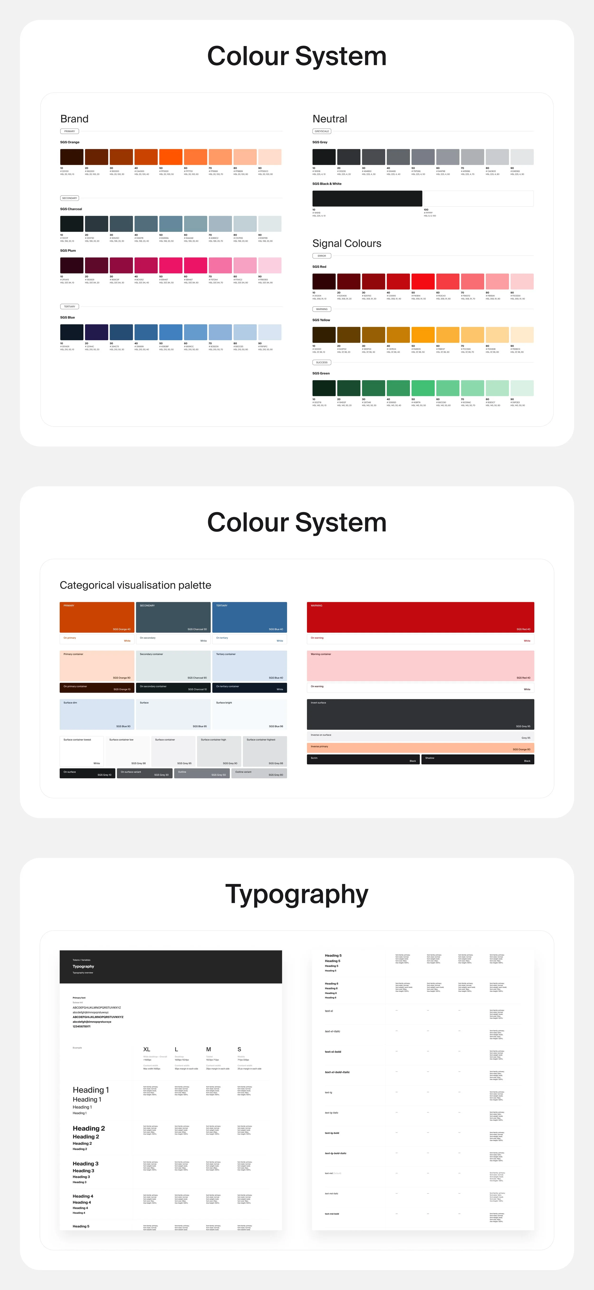
The color system lacked proper scaling, resulting in inconsistencies
The typography system had multiple versions which was confusing development.
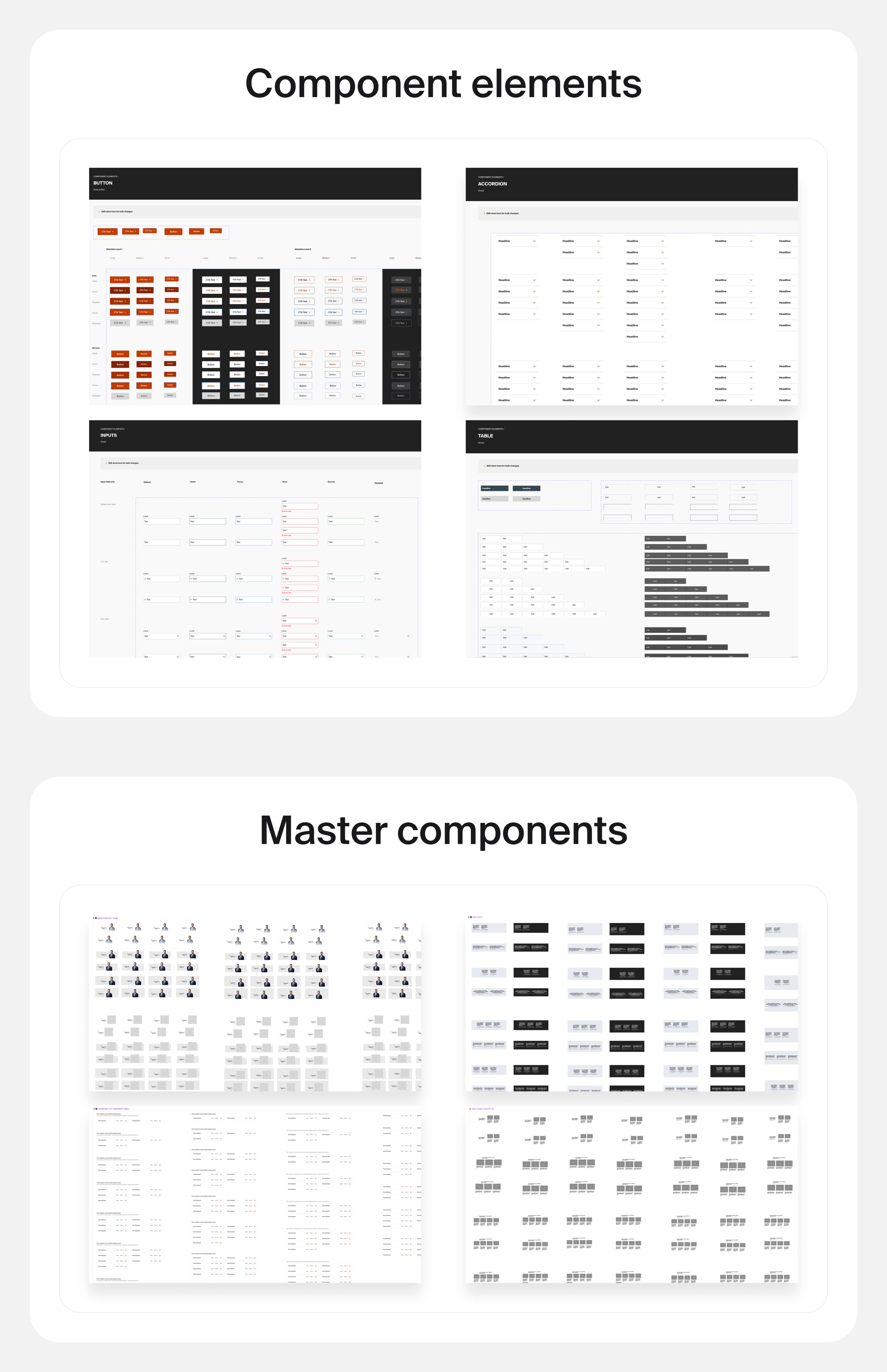
The shadow system was inconsistent, forcing designers to create variations manually.
Basic button components existed but did not meet accessibility requirements and needed expansion to facilitate faster design processes.
Research and Analysis
To inform the redesign, I conducted extensive research on modern design trends, industry standards, and best practices. This included analyzing user feedback and studying design systems used by other companies.
I focused on understanding the grid system, which is crucial for pixel-perfect design and development. Collaboration with developers was key. I also drew inspiration from several design system resources, including:
This research deepened my understanding of color, typography, and basic components, which were essential for scaling and expanding our design system.
Design
The design phase was a comprehensive build of a brand new design system for the SGS. We began by redefining the grid system to ensure consistency between design and development. The colour system was recalibrated to correct inconsistencies, achieving better contrast and balance. The typography system was refined for improved readability and consistency across platforms, resolving confusion between the different styles. We standardised the shadow system, providing designers with predefined options, and designed a brand new component library to support faster and more efficient design processes. All of this was supported by a detailed documentations for the developers and use case examples for other designers. We used atomic design system taxonomy, composed of foundations, elements, components, and patterns. Designs for each component are stored in a Figma library, and working examples can be viewed and configured in Storybook.
Throughout this process, I collaborated closely with developers, ensuring consistency and scalability across all digital assets.